No Products in the Cart
If you are dressing a 1990s set right now, the short answer is this: source from artists whose practice actually spans that window, not from stock photo libraries or contemporary print-on-demand services. The decade has a specific visual signature, and a contemporary giclee on a black metal frame will read wrong in the first dailies. The fastest path is a cleared-art rental partner with a deep roster of painters and photographers who were exhibiting between 1990 and 1999, paired with a 24-hour turnaround so last-minute script notes do not blow up your build week.
The 1990s nostalgia wave is real and it is still building. Yellowjackets, Pam & Tommy, I Love That For You, the Reservation Dogs flashback episodes, the post Stranger Things 80s-into-90s adjacency, and a steady stream of dot com era projects all need walls dressed with art that reads as decade-correct without looking like a Pinterest board of the era. Set decorators searching for this work right now have a real sourcing problem, because most cleared art services and most period reference databases are deepest on the 1960s, 70s, and 80s. The 90s tend to fall in a gap that is too recent for vintage and too old for contemporary.
What 1990s art actually looks like on screen
Before you start sourcing, it helps to be specific about what the decade looked like on a wall, because the cues are different from what most period mood boards capture. Abstract expressionism was in its final mainstream wave, which meant a lot of gestural, large-scale canvases in residential and corporate sets. Photo-based and conceptual work moved out of galleries and into the mainstream. The dominant palette was muted, not loud: dusty pinks, mustard yellows, sage greens, taupes, oxidized teals. The blown out neons people associate with the 90s lived mostly on T-shirts and skate decks, not on living room walls.
Materials matter as much as imagery. The 1990s relied heavily on matte papers, screenprints, lithographs, and gelatin silver photography. Framing leaned matte black metal, distressed wood, and oversized white mats with visible bevels. If you frame a piece in a thin contemporary aluminum profile, you have already lost the era. The specific genres that read most clearly as 90s on a set include the last wave of airbrush realism, riot grrrl and zine adjacent collage, post grunge minimalism, and the early wave of digital-and-photography hybrid work that ran through art school programs in the second half of the decade.
The single fastest fix when something looks wrong is to check the frame, the mat width, and the saturation of the print. If those three feel current, the piece will read as 2020s no matter how convincingly the rest of the set is dressed.
Where to actually source the work
The reliable sources, in order of how much each is worth your time:
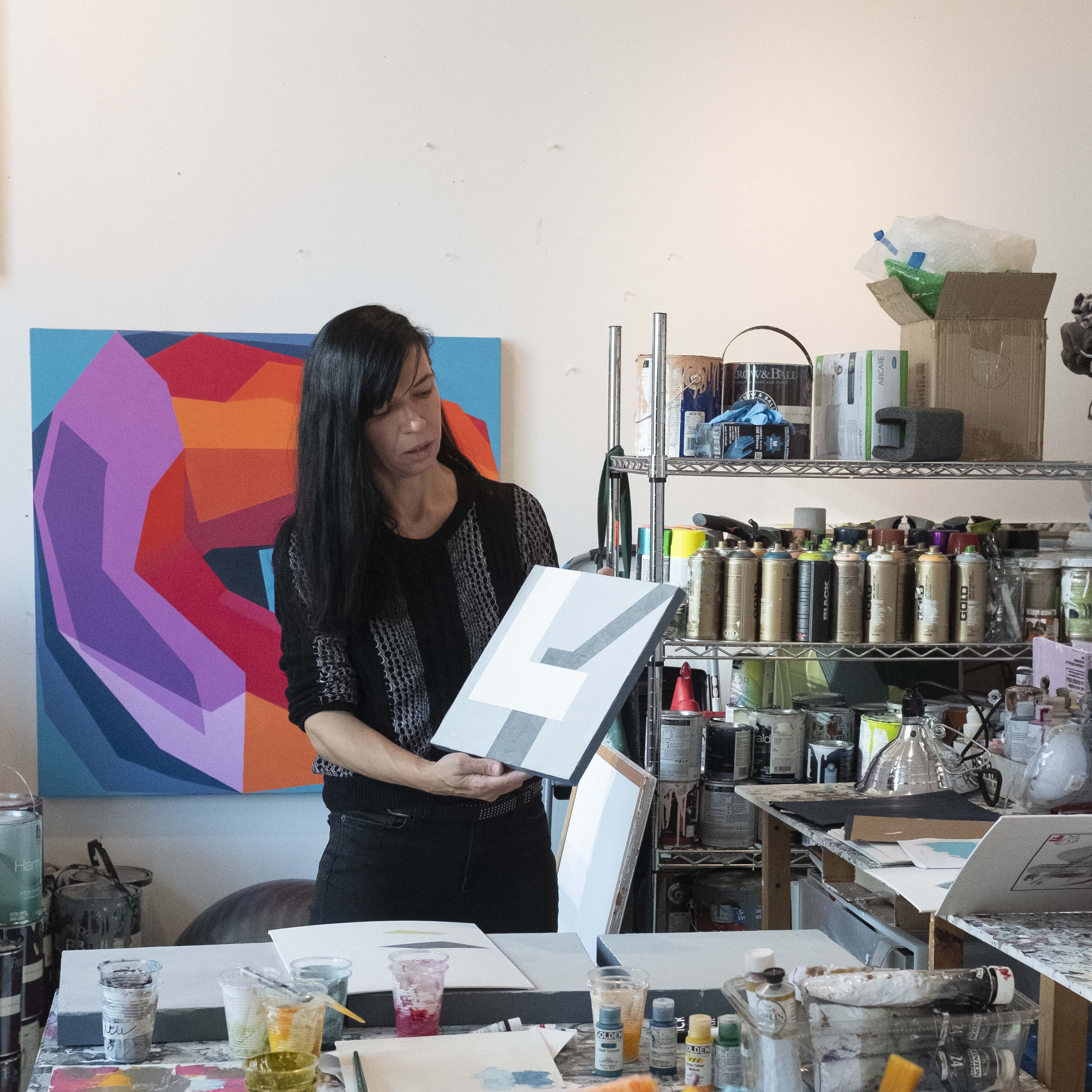
Cleared art rental services with a deep 90s-era roster. The decade is recent enough that many of the artists who were active in that window are still represented, still making work, and still licensable on a clean rental contract. A good rental partner can pull thirty pieces in a single afternoon, ship them next day, and swap any that do not work once the DP has lit the set. The advantage over buying or sourcing through auction is the swap, which is the single biggest stress reliever on a set that has not locked picture yet. Curina sits in this category, and our roster includes a meaningful number of artists whose practice spans the 1990s as well as period-aligned contemporary work that reads correctly when shot. Our Film and Television page covers the rental specifics in detail.
Estate and studio collections of artists active in the 90s. Many estates and studios sell or license directly. The catch is timeline. If you need the piece in the truck by Thursday, this path will fail roughly half the time. Use it for early prep, when you have a few weeks and a specific artist in mind.
University and MFA program archives. Programs that peaked in the decade, particularly photo and printmaking programs, often have alumni archives that can be licensed. This is slow but turns up genuinely unfamiliar work, which matters when the showrunner wants something that feels period-specific without being recognizable.
What to avoid. Stock photo sites, print on demand services, and current digital reproductions. Even when the source image was made in 1994, the printing process, the paper, and the frame they ship with will read as contemporary. A camera will catch it. Save these sources for greenscreen replacements and posters where the prop master will reframe anyway.
Set-by-set guidance for the 1990s look
The decade did not look the same in every room, and a set that flattens those differences will feel off even when the individual pieces are correct. A few specifics:
Suburban living rooms. One large piece above the sofa, almost always abstract or floral, in a muted palette with a wide white mat and a matte black or distressed wood frame. The "family wall" arrangement, with a mix of professional portraits and casual photos in a grid, reads as instantly 90s. The portraits should have the slightly cool saturation of 90s drugstore developing and a soft vignette.
Corporate offices. Large-format abstracts in oxidized teal, taupe, or mustard. The genre of "motivational" framed prints peaked in this decade, so a single one of those in a partner office is period-correct shorthand. Golf and sailing photography, framed conservatively, signals the executive suite.
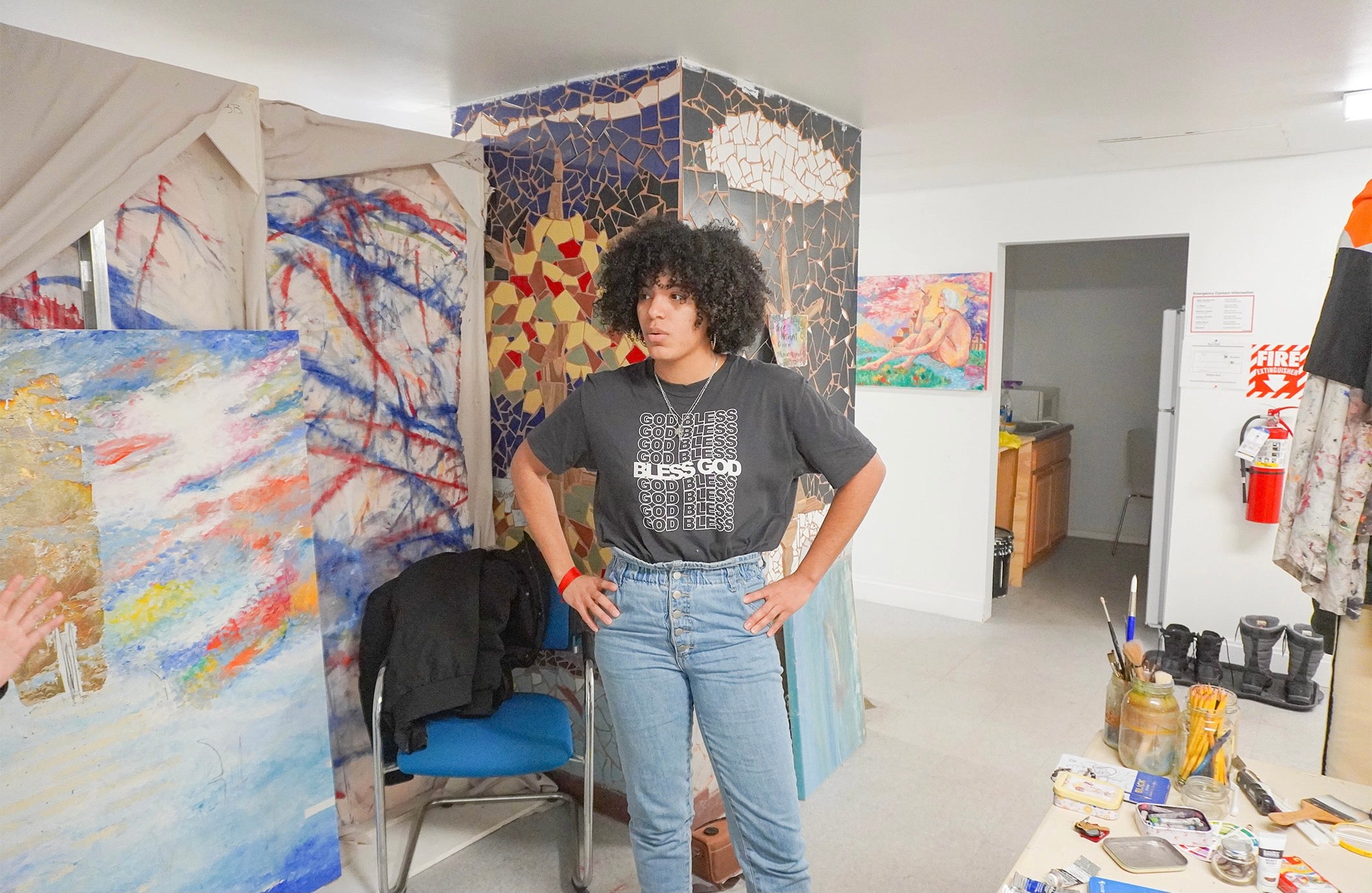
Teen and college bedrooms. This is where the decade reads loudest. Tear-out magazine collages taped to the wall, posters in plastic clip frames, polaroids strung on jute twine, lo-fi photos of friends in repeating poses. The art is not framed because the character is fifteen. The mistake here is hanging anything with a proper mat or museum frame.
Galleries and creative spaces. Clean white walls, single statement pieces hung well above standard eye line at 60 to 64 inches center, often with minimal labels. The 90s gallery look was austere even when the work itself was not.
For a broader companion read on how decorators currently source pieces across genres, the recent post on where set decorators find art for film and TV covers the contemporary sourcing landscape, and the conversation with set decorator Monica in the "Art, Clearance and Chaos" piece walks through how clearance windows actually work under real production deadlines.
Production timeline realities
The reason rental beats purchase or estate licensing for most set decorators is not the cost. It is the timeline. A typical 1990s-set production has the art department locking decisions one to two weeks before each setup, and rewrites or location changes can collapse that to forty eight hours. A cleared art partner who can pull, package, and ship next day is the only category that holds up under those conditions. If you are working on a series with multiple 90s-set episodes, build the relationship now, in prep, not during the first crunch. A vendor who already knows your show's palette and clearance bar can act in hours instead of days.
It is also worth budgeting in a single in-prep swap per major set. Even decorators who have worked the era for years guess wrong occasionally, usually on scale. A piece that looked right on the studio floor reads small once the camera is in. Plan for one swap, and you will only use it half the time, which means the budget line stays comfortable.
How Curina fits
Curina represents more than 6,000 cleared works from a roster of working artists, with a meaningful concentration of practices that span or directly evoke the 1990s. We ship cleared art with a rental contract that covers film, episodic, and streaming use, with 24-hour turnaround on most requests in the continental US. The swap model is built into the contract, so a piece that does not land on camera can be exchanged without renegotiating. We have shipped to network shows, indie features, and streaming originals, and our standard rental terms are designed for production schedules, not for residential timelines.
For broader context on how productions use cleared art, the Magazine's list of films and shows where art drives the plot is a useful reference, and the rest of the Magazine covers ongoing thinking on sourcing, clearance, and design.
Need cleared 1990s-era art for a production?
Browse the roster, talk to a curator about your show's palette, or get a same-week pull together for an upcoming shoot.
The 90s wave is going to keep building for at least another two or three production cycles. Decorators who have a cleared art relationship in place now will spend the next two years closing decisions in hours instead of weeks, and their shows will look right on the wall. That is the entire game.